Signs of the times
Three graphic design tours of Zürich
Published in the Financial Times Globetrotter column, 13 May 2023
“It was like stepping into the future, a living exhibition of avant-garde design, a kaleidoscope of Constructivist billboards and modernist fonts,” recalled the designer Richard Hollis when telling me about his first visit to Zürich in 1958. “In the graphic design faculty of the Kunstgewerbeschule (applied arts school), the teachers and students were wearing white lab coats.” This was the heyday of what became known as the Swiss International Style, a style so precise, neutral and modern that it was adopted across the world, with Swiss typefaces such as Helvetica being used by IBM, Lufthansa and the New York subway.
A walk through Zürich today reveals numerous modernist graphic design treasures alongside older and more traditional (and sometimes comfortingly kitsch) offerings, as well as more playful and, at times, rebellious works — reflections of Zürich’s cosmopolitanism and variety: a city in which bankers and Dadaists are equally at home. Zürich is a profoundly visual city and its tradition of graphic design goes back hundreds of years, from the colourful signs of the medieval guildhalls to old shopfronts and sophisticated contemporary design.
Walk 1: Modern to medieval
— Zürich HB train station to Münsterhof
(Including stops: 1-1.5 hours; if just walking: 15-20 minutes)
Position yourself on a platform in Zürich’s magnificent Hauptbahnhof, one of the great stations of middle Europe, and you will be surrounded by several touchpoints of Swiss design. The gleaming train before you displays Hans Hartmann’s impeccable double-arrow motif (1972), with its trilingual cipher by the great Josef Müller-Brockmann demonstrating how Swiss signage caters for Switzerland’s three main languages with clarity and elegance.
As you walk around the station, admire Müller-Brockmann’s design system which, in a declension of Helvetica, encompasses every aspect of Swiss rail travel: arrivals and departures, signposts and matching pictograms. Finally, look up at the numerous Swiss railway clocks, still using Hans Hilfiker’s 1952 design with its red second-hand in the form of a station master’s baton.
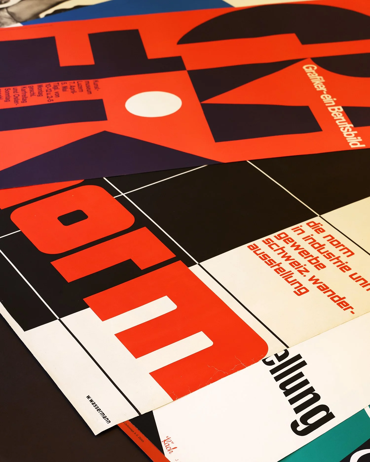
Exit the station and walk down the Bahnhofstrasse, turning left at Werdmühlestrasse. There, in the handsome 1930s Amtshaus V government building (lovely lettering over the door), you will find Zürich’s leading poster gallery, Placart, and its immensely knowledgeable owner Tomas Rabara. Rabara’s stock ranges from Swiss travel posters (look out for Manfred Bingler’s photographic work for Swissair and the 1970s aerial views by Gerster & Schulthess— how these made me dream as a boy) to Concrete delights by Max Bill and gems by Müller-Brockmann and Kurt Wirth. This is the perfect place to enjoy the richness of Swiss graphic art, from Alpine Gemütlichkeit to hard-edged Constructivism, with a wide selection of works displayed and many more in plan chests available to view. You could spend anything from a few minutes to many hours here.
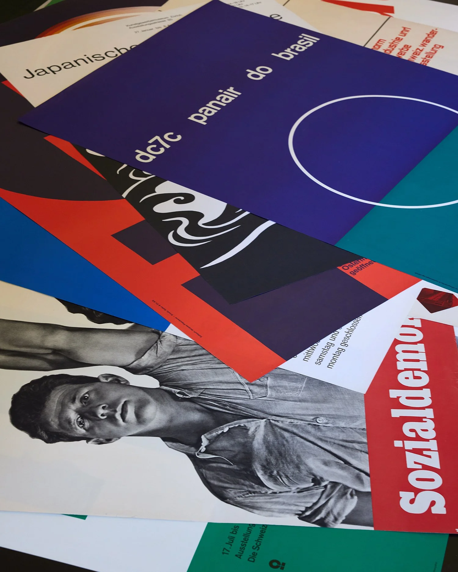
Some of the many examples of great modernist design to be found at Zürich poster gallery Placart
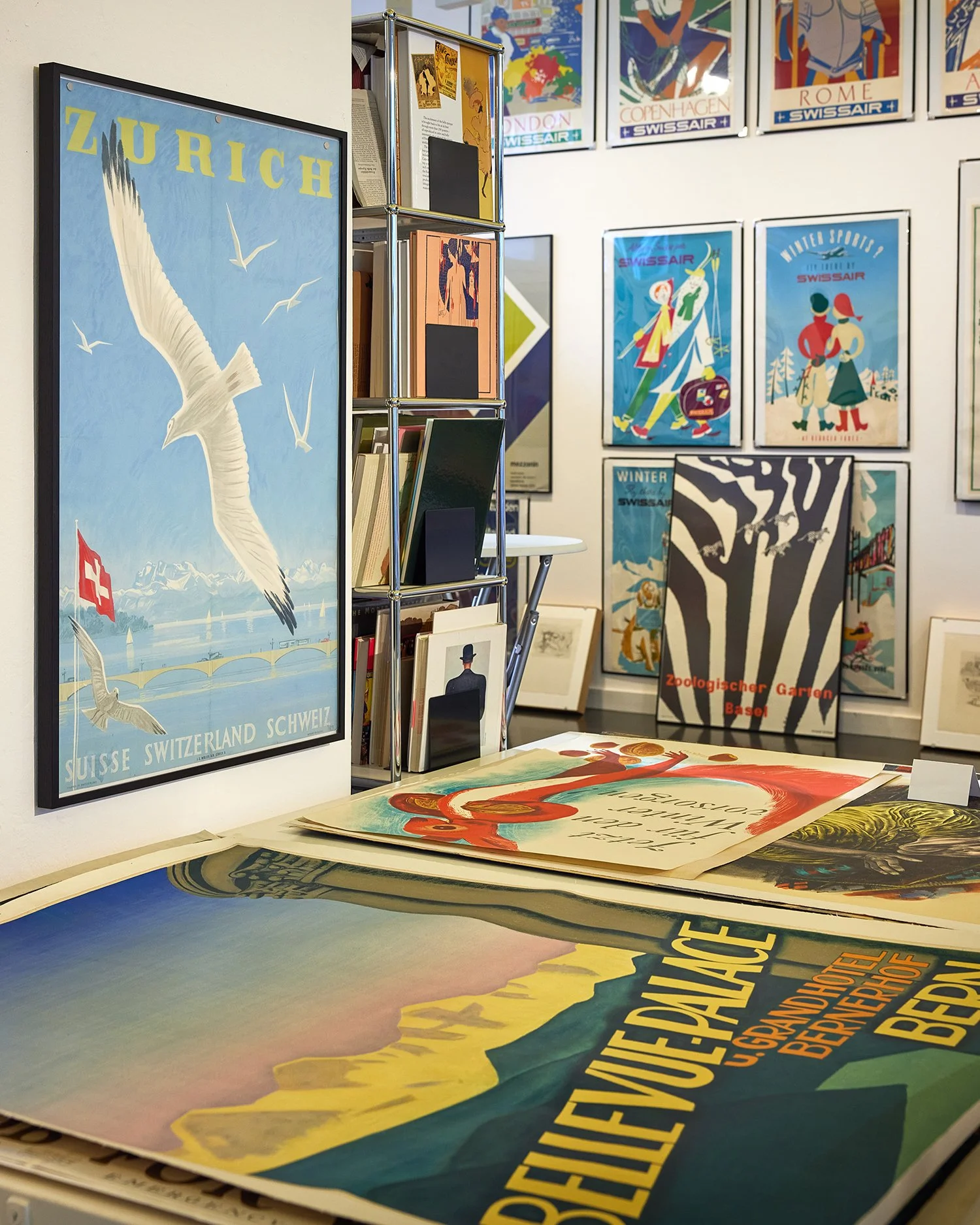
The gallery stocks a wide range of classic Swiss travel posters
Return to the Bahnhofstrasse, the bastion of the serif typeface (see “Serif vs Sans Serif” below), continuing towards Paradeplatz, with a quick detour into Rennweg.In between generic international stores are traces of more homegrown graphics: at Rennweg 53 is the traditional Confiserie Honold with its elegantly retro logo (and look across the street for the old chemists’ sign); at Bahnhofstrasse 44, admire the wonderfully evocative logo of Bruno’s outfitters. At Paradeplatz, we arrive at one of Zürich’s great traditional brands, Sprüngli, with its numerous sub-brands such as the gloriously glamorous VIP pralines range or the patrician Limmat selection —the more sugary end of Swiss design, but still precise and beautiful.

The glasses logo at Zwicker the opticians on Postrasse

The centuries-old Kämbel guild logo on Münsterhof
We finish by walking down the Poststrasse, with the charming old logos of ElsässerCoiffure (No 8) and Zwicker the (unmistakable) opticians (No 1), and on to the ancient Münsterhof for our grand finale of Zürich graphic art through the centuries. Here you will find the old Kämbel guild building (No 18) with its 15th-century camel logo and its suave 1960s Leder Locher logo, the 19th-centuryumbrella-makers’ sign (Schirmfabrik) (No 14) and next door the early-20th-century logo of the Büro-Fürrer stationers (No 13).
Walk 2: Bellevueplatz to Heimplatz
(Including stops: 45 minutes; if just walking: 10—15 minutes)
Shelter beneath the glorious 1930s canopy of the Bellevue tram stop to take in Ernst Hiestand’s modular signage system — another clear and logical design, much copied but still fresh after more than 40 years.

Behind you in the square, you will quickly notice the arched CORSO sign, a 1934 work by celebrated Swiss artist Max Bill, perched tiara-like atop its bouffant fin-de-siècle building with its elliptical “O”. This building housed the Corso theatre (now cinema), as well as the Mascotte nightclub where Josephine Baker, Louis Armstrong and many others performed and which Max Ernst decorated with a mural. (You will find examples of rooftop signage across Zürich, many of which are now listed. One of the most famous of these, a short walk from the Bahnhofstrasse, is the Ober sign by Ernst Keller (1932), a founder of Swiss International Style. The tradition has been carried on atop the Freitag tower, the stack of containers in Zurich-West (2006).)

Swiss International Style pioneer Ernst Keller’s Ober sign from the 1930s

The Freitag tower, a stack of containers in Zürich-West
From here, ascend the Rämistrasse to Heimplatz, admiring the 1920s lettering on the facade of the Kronenhalle, Zürich’s most celebrated brasserie, the gorgeous1960s heraldic car-park sign (see “Heraldry in Design” below) and many wonderful galleries.
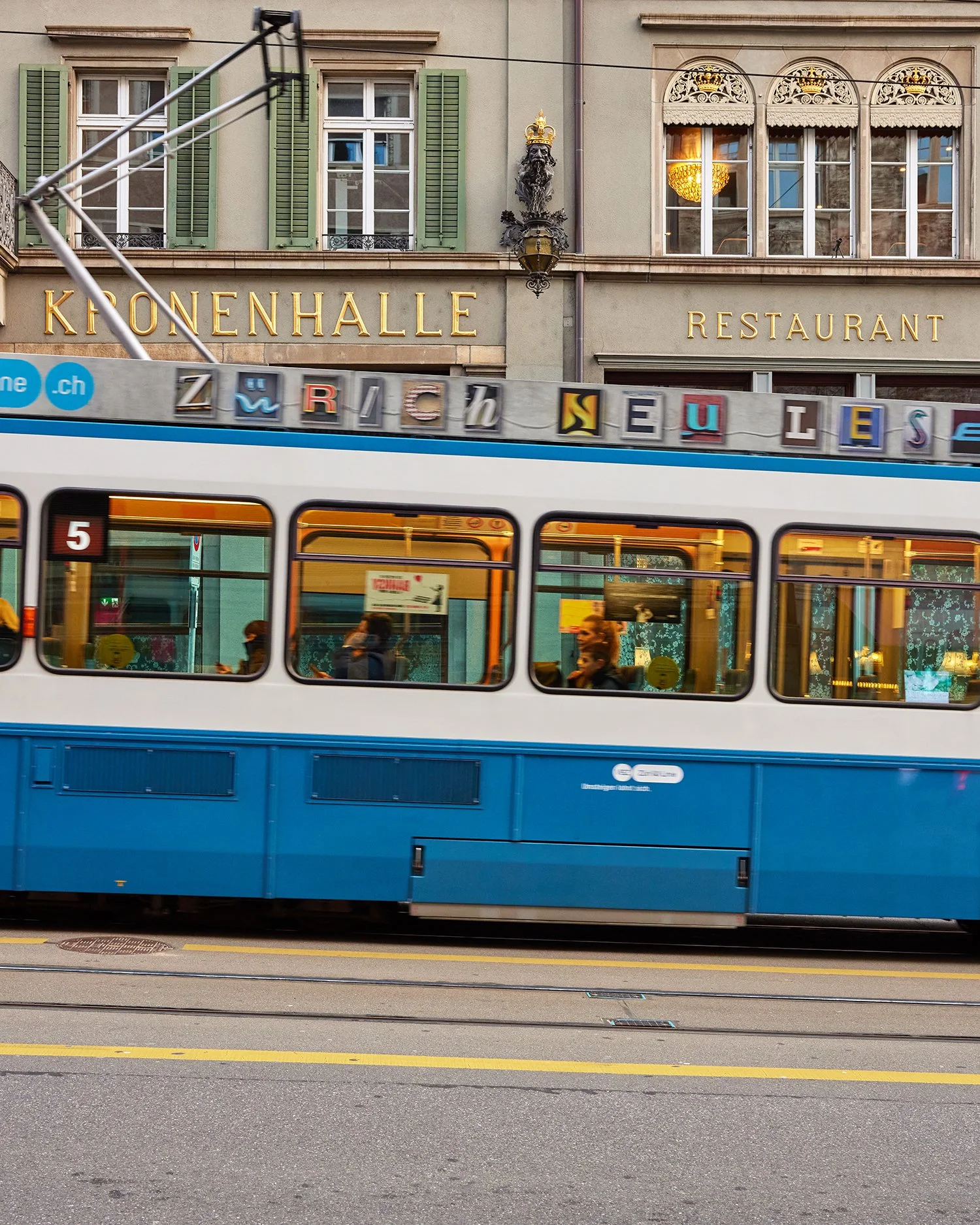
The 1920s lettering on the facade of the Kronenhalle brasserie

The 1960s heraldic design on a Zürich car park
The Schauspielhaus (Heimplatz), apart from being one of the leading theatres of the German-speaking world, has also become one of Zürich’s most active patrons of design, giving control of its visual identity to luminaries such as Cornel Windlinand Studio Geissbühler. Here the aesthetic is witty and playful, starting with Laurenz Brunner’s illuminated logo in which the shapes of S’s and Z’s are switched and subverted through to the assorted suite of programmes and posters.

The interior of the new David Chipperfield building at Kunsthaus Zürich
The three other sides of this square are taken up by Zürich’s main art museum, the Kunsthaus, with its four contrasting buildings by Karl Moser (1910), the Pfisterbrothers (1958), Erwin Müller (1976) and David Chipperfield (2021). Graphic design links the constituent parts of this ensemble across the busy square. The sleek modernist logo on the side of the Pfister building has been repeated in a more luxurious golden-bronze idiom above the entrance to the Chipperfield building. This bronze, in turn, is taken into the new building, where it appears in the exquisite signage by L2M3.
Walk 3: Museum für Gestaltung

Postcards depicting objects of modernist design inside the Museum für Gestaltung’s new building

The museum’s modernist 1930s building
A short walk from the Hauptbahnhof is the original Museum für Gestaltung(design museum). The museum (Austellungsstrasse 60) is in a handsome 1930smodernist building, attached to the Zürich design school that Hollis visited in1958. The museum was first known as Kunstgewerbemuseum (museum of applied arts) and its logo designed by Keller (who taught at the school from 1918-58). When the museum changed its name, the original lettering was (controversially)repurposed with a view to keeping the integrity of the aesthetic. This museum and its new building (Toni-Areal, a short ride on the No 4 tram) are essential stops for enthusiasts of Swiss design, especially the tour of the incredible storage rooms (by appointment), temporary exhibitions and bookshop. The new building remains attached to the design school, although today’s students seem to have forsaken their lab coats.
Heraldry in design

Zürich’s trams are painted in the colours of the canton’s flag
Heraldry plays an important part in Zürich design, with the blue and white Zurich flag (and its attendant lions) being used across the city. It is a visually and socially unifying device: from the grandest hotel in Zürich, the Baur au Lac (which recently reintroduced the colours to its logo after 107 years of monochrome heraldry), to the Zürich tram, the local savings bank and mooring posts for riverboats, the colours give the visitor a real sense of place. It appears in many guises from the Brutalist charm of a 1960s car park (see above) through to the witty subversion of the crest on the mineral water at the elegant Zunfthaus zurWaag restaurant.
Serif vs Sans Serif

For a country so famed for its sans-serif fonts, Switzerland has a surprising number of brands with serif typefaces. Stroll down the Bahnhofstrasse and you will observe that many of the grand Swiss watchmakers (Audemars Piguet, IWC, Rolex, Piaget) and banks (UBS, Julius Bär, Pictet) have seriffed fonts, conveying a sense of tradition and solidity. Every now and then, however, you come across a hybrid: the Baur-au-Lac’s logo incorporates both serif and sans-serif — at once venerable and contemporary — while the minimalist lettering in the Chipperfield extension of the Kunsthaus sports a single, rather playful, serif on its letter L (but not on any other).
Photography by Laura Hodgson